brand identity and website design
kristen mansch yoga I branding I website
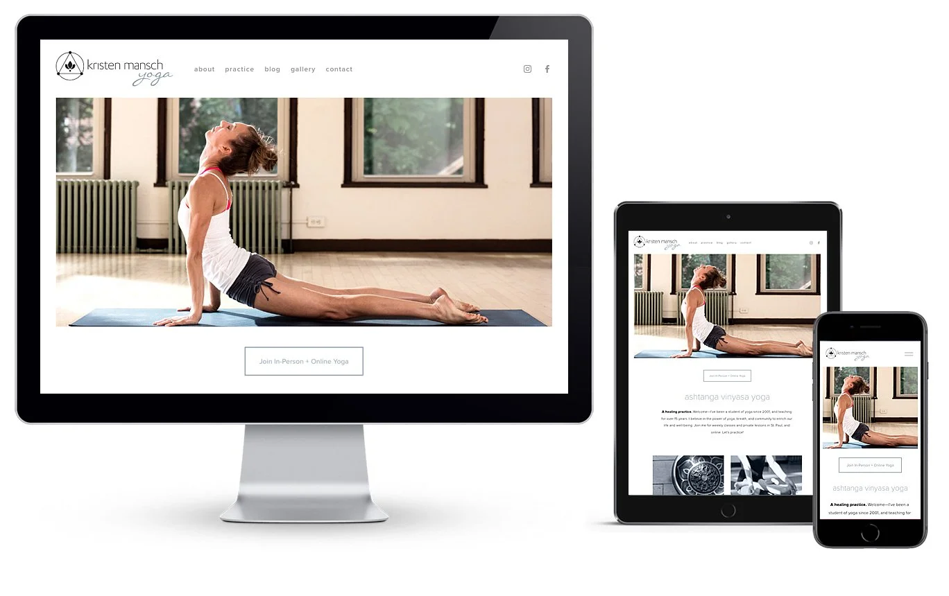
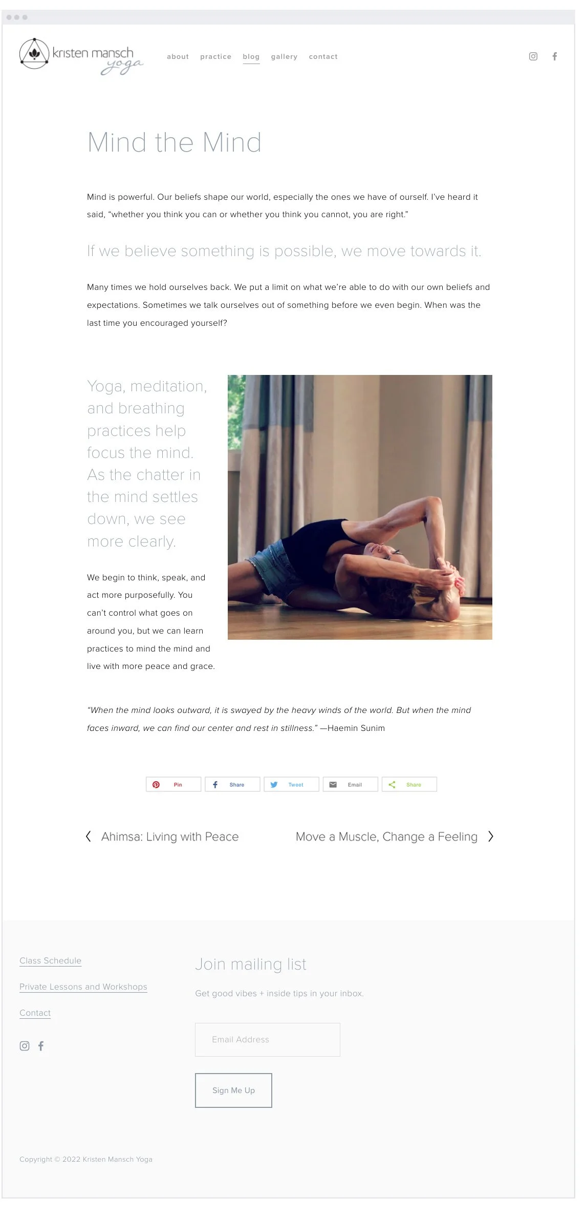
Being both the designer and client for this project was a unique challenge. I’m a longtime yoga teacher and needed a fresh logo, consistent brand, and engaging website. A logo is the heart of a brand; as such the logo design came first. The lotus center represents the light within each of us; the three dots connected with a triangle reference sacred units of three (i.e. mind-body-spirit; sattva-rajas-tamas; practice-teacher-community); the circle holding it all represents unity. The brand style was then applied to a user-friendly website. The site features a calm color palette, big images and color blocks, along with modern typography and a well-balanced layout.
client: kristen mansch yoga
services: design + art direction


